Interface Feedback Guideline Patterns
Each Interface feedback component has design properties that define its pronunciation level.

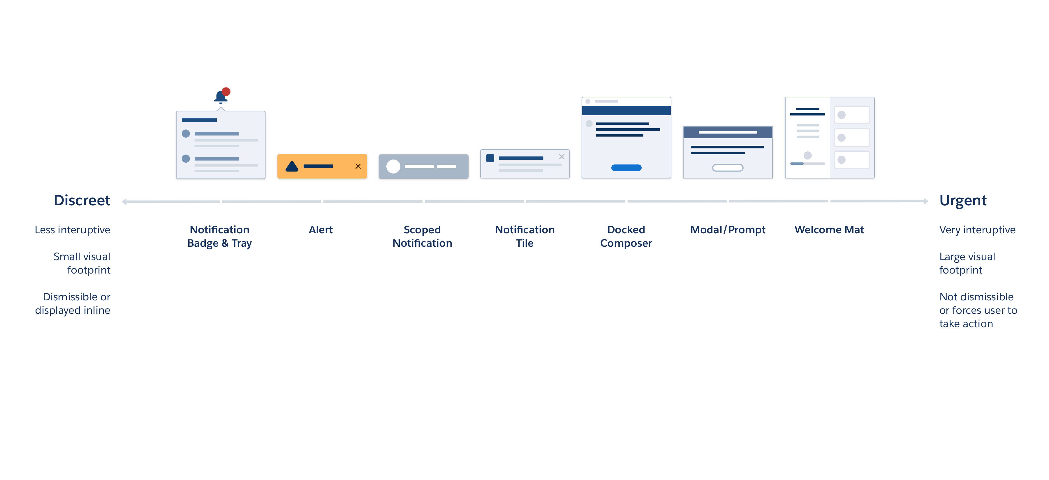
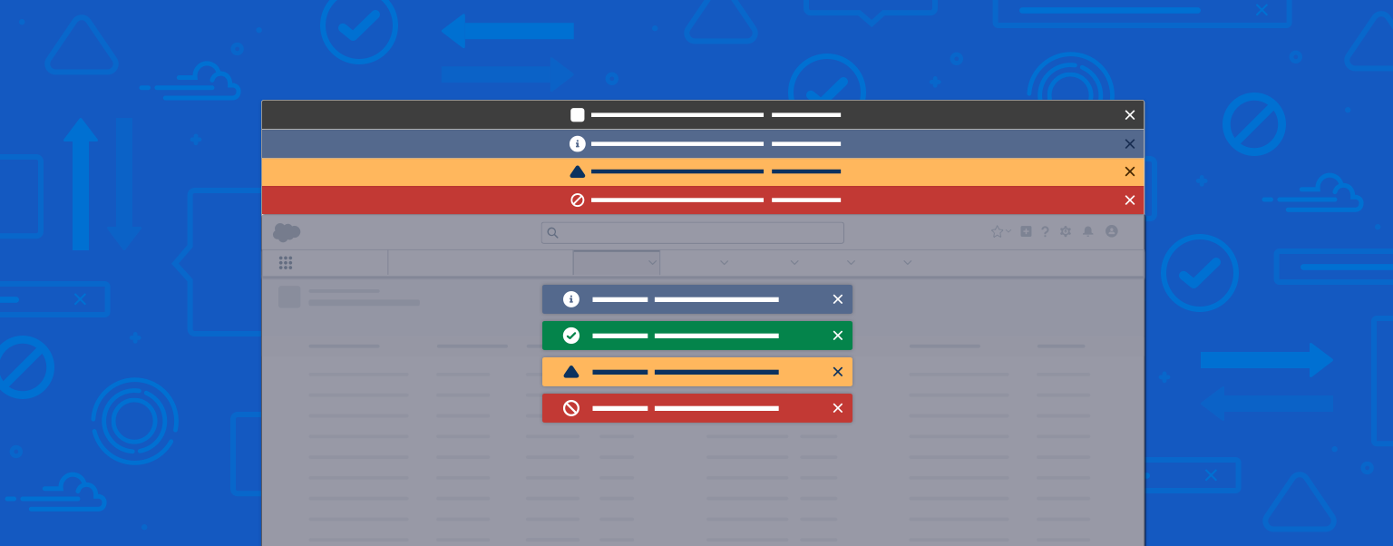
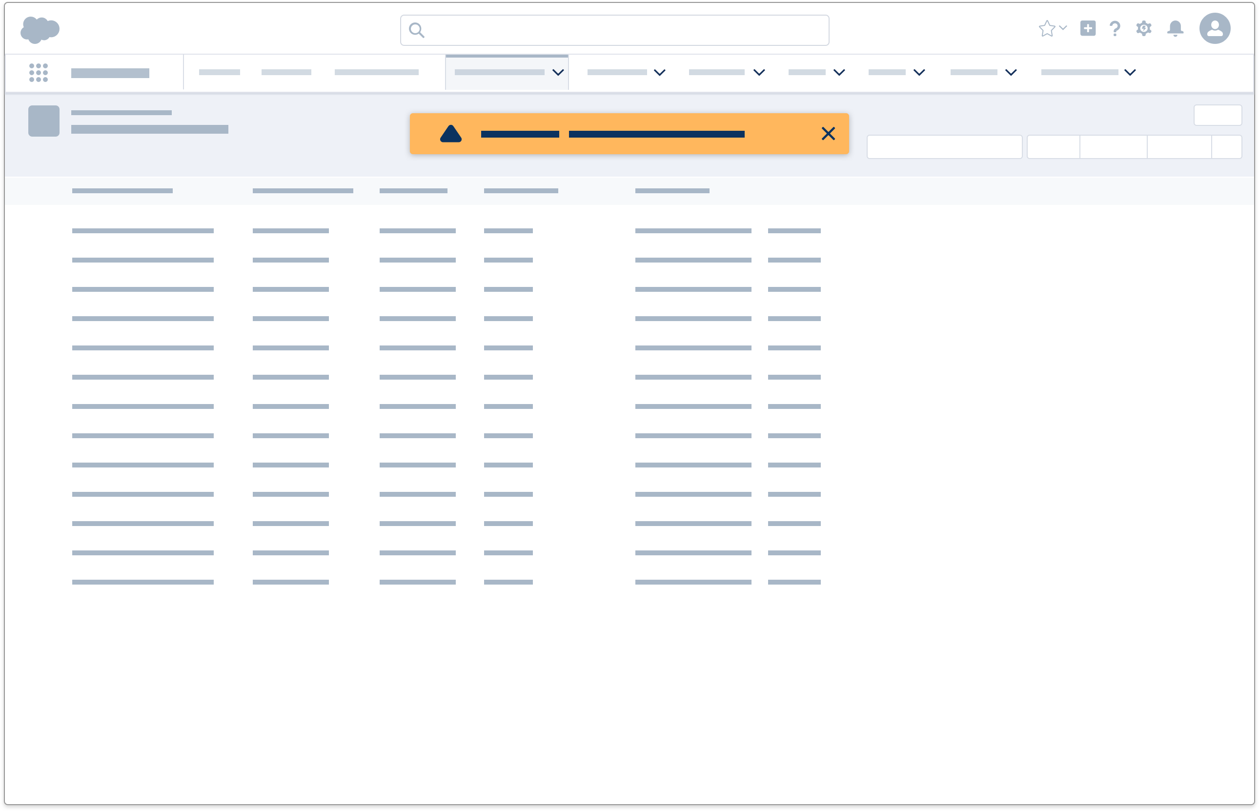
Interface Feedback Landscape
Inline Text
Visibility
Discreet
Description
Inline text communicates messages in a non-obstructive way. As its name suggests, it's displayed inline and doesn't block any other part of the interface.
Component
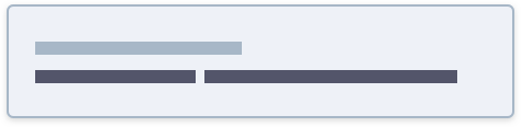
Popover
Visibility
Less discreet
Description
A popover calls attention to a problem or a potential problem with a field or record. It contains a title and body with optional inline links.
Component

Toast
Visibility
Elevated
Description
A toast serves as a reactive element of feedback & confirmation mechanism after a user has taken an action. A toast appears in reaction to user action: creating, editing, deleting.
Component

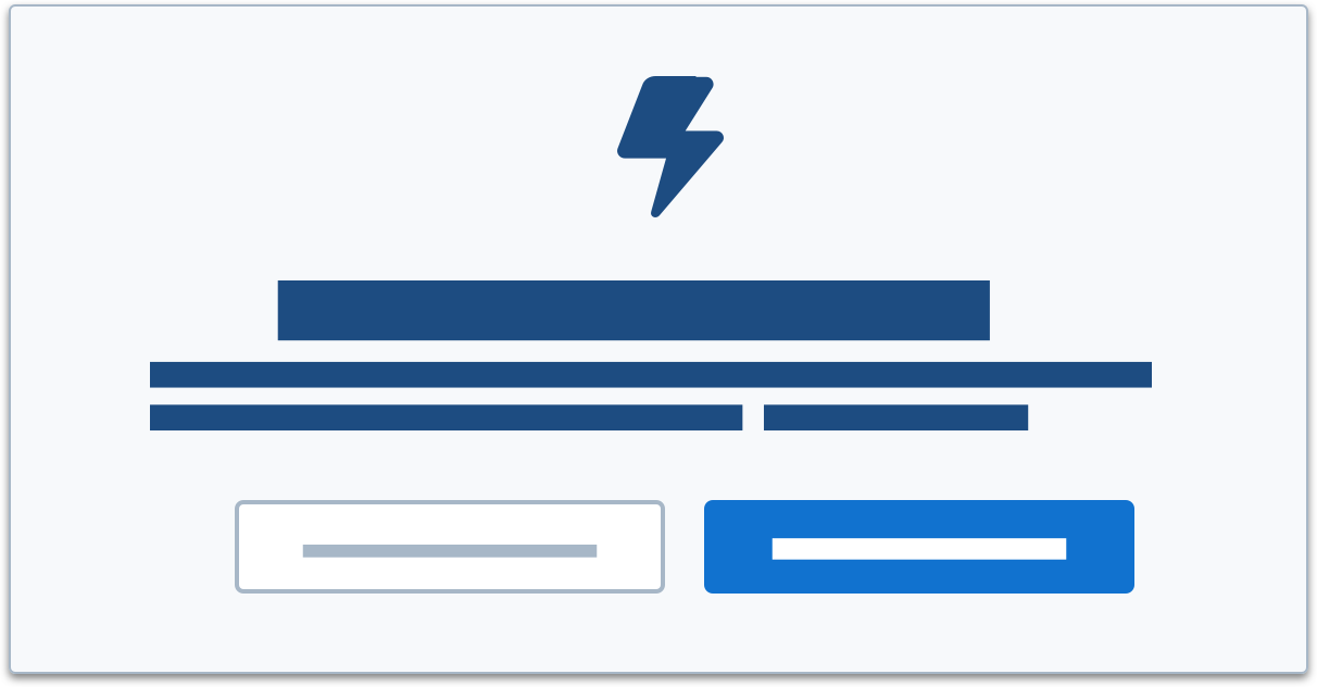
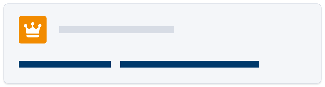
Illustration With Inline Text
Visibility
Elevated
Description
Illustration and inline text work in tandem to communicate a state in a more visually delightful, approachable way.
Component

Docked-Composer
Visibility
Urgent
Description
The Docked Composer communicates dense, insightful information in-context of a user's workflow. In a help and learning context, this panel may contain instructions, guidance, or learning material that a user can refer to while working.
Component
Docked Composer (for persistent UI elements)
Also see User Engagement

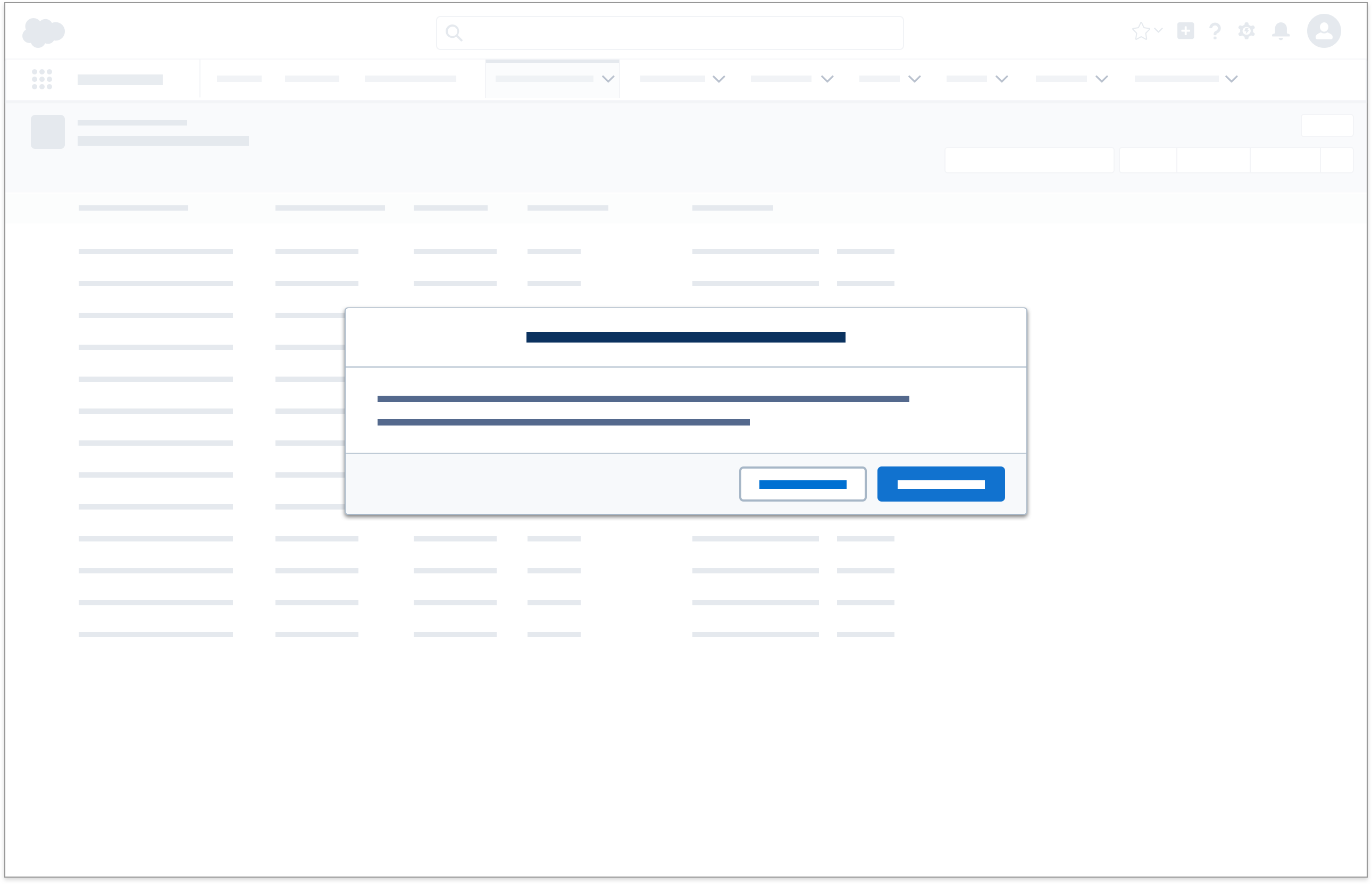
Modal/Prompt
Visibility
Urgent
Description
Modals and prompts display information in a layer above the app. They're centered vertically within the viewport. To dismiss a prompt, the user must confirm its call to action. To dismiss a modal, the user can select the close icon or cancel button, or click anywhere outside the dialog window.
Component
Feedback States
Feedback states are generated in response to direct user action, and as such, the tone and pronunciation of the feedback state should mirror the urgency or consequence of the user's action. There are six key feedback states.
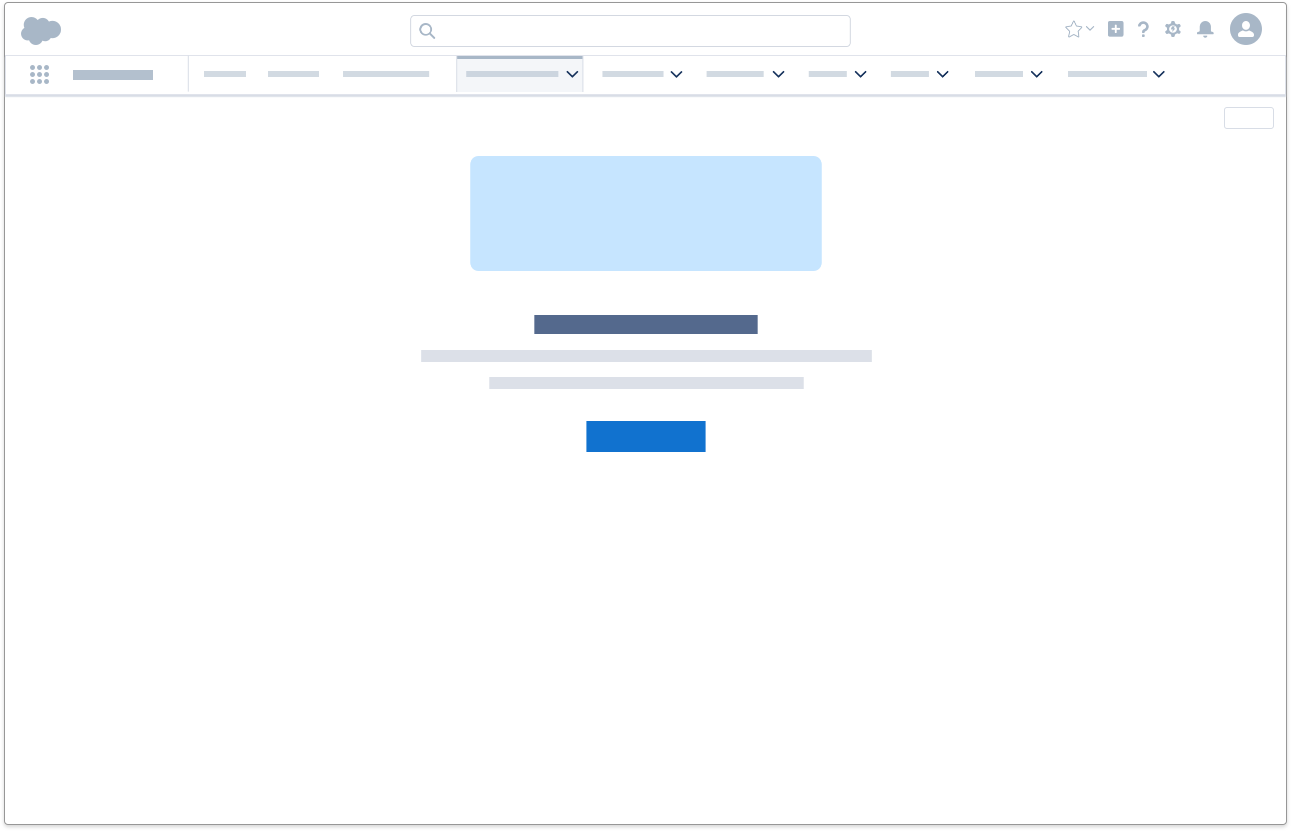
Empty States
An empty state is triggered when a component or page has no content to display. It is used in the following scenarios:
Empty Component
When a component has no item to show, display inline text.
Empty Page
When an entire page has no data available or the system is inaccessible, display an illustration with inline text.
Error States
An error state can appear in these scenarios:
- A user submits a form that contains error on one or more fields
- A user completes an action (e.g. submitting a form), but system-related issues prevent the action to be completed
- A card's content cannot be loaded
- A system related error is affecting the user's current session
- A system related error occurs at random
- A page's content is inaccessible (e.g. it cannot be found, user doesn't have sufficient privilege, etc)
Each scenario encompasses a slightly different error state, as shown below.
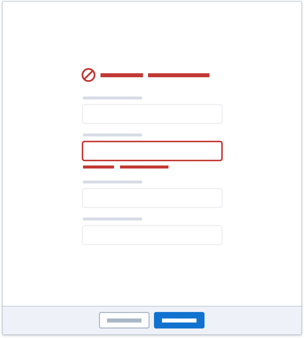
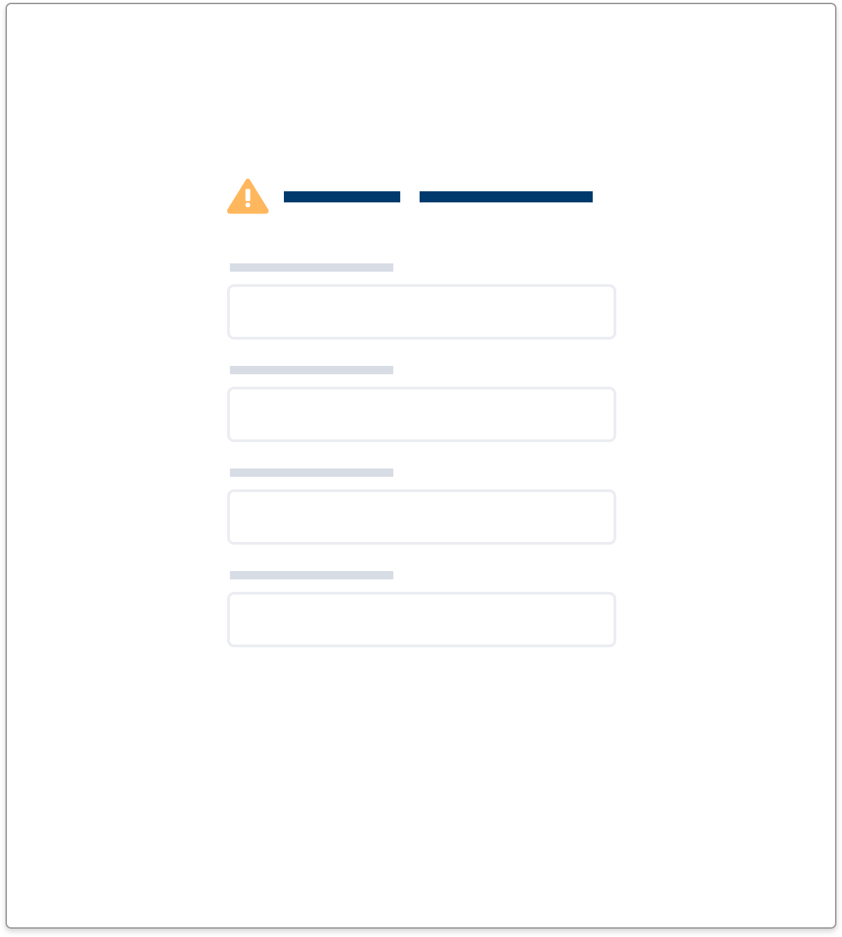
Form Field Error
When a user submits a form that contains error on one or more fields, display a pairing of inline text and a popover
The field level inline text displays an error message relevant to that field (e.g. phone number cannot contain letters), whereas the popover shows a high level summary (e.g. Review the following fields: phone number).
Accessibility Note: If there is only one error message, set focus on the field containing an error. If there is more than one error summarize them in an error message at the top of the page, set focus there, and provide a list of the errors with each item having a LINK jump to the relevant field. This summary should be persistent and easily reachable.
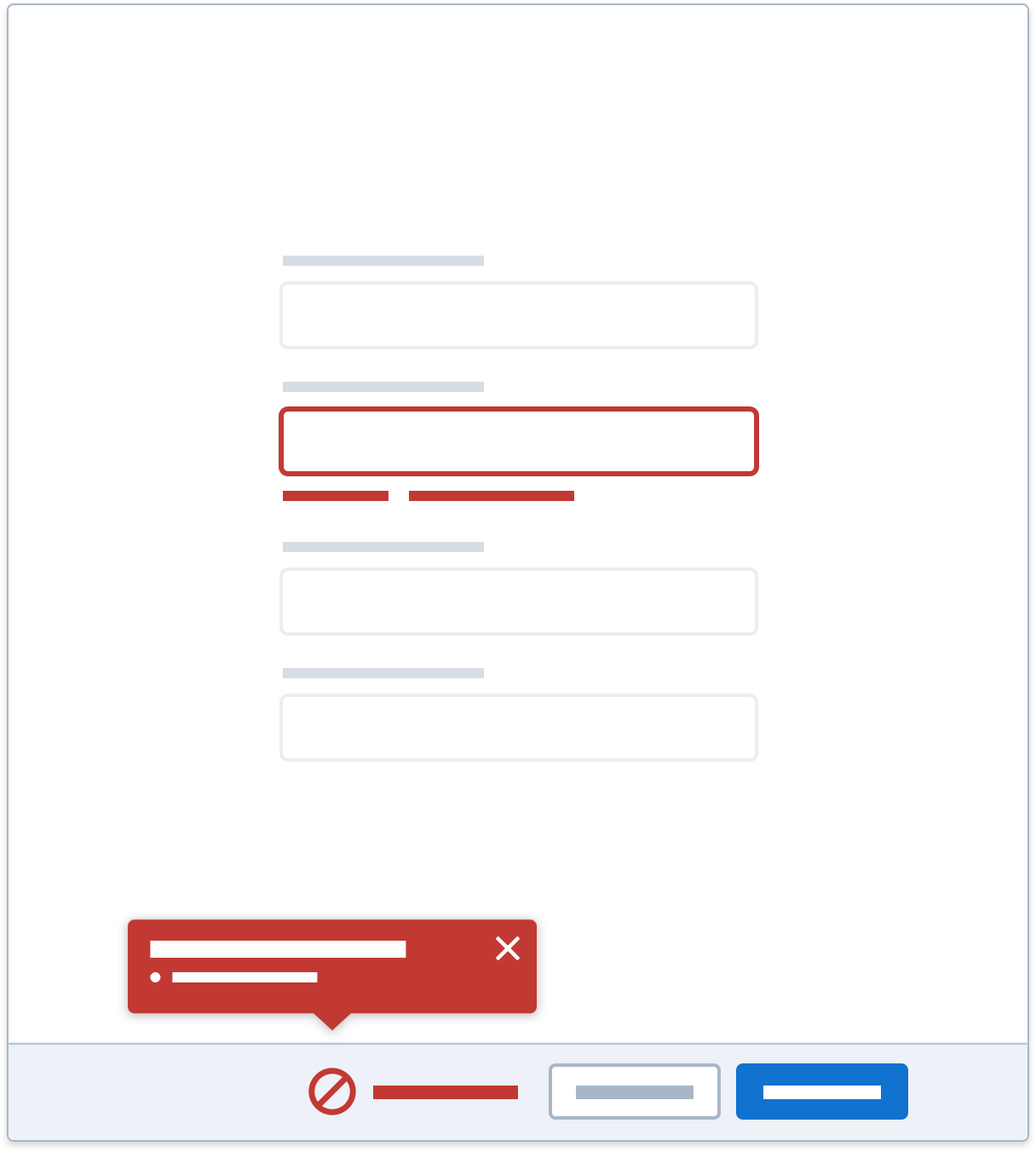
Alternatively, if a popover is not feasible in your design, then display the icon variant of inline text.
Incomplete Action Error
In the rare instance a user submits an action and system-related issues prevent the action from executing, display an error toast.
Card Content Error
When data inside a component cannot be loaded, display an inline text error.
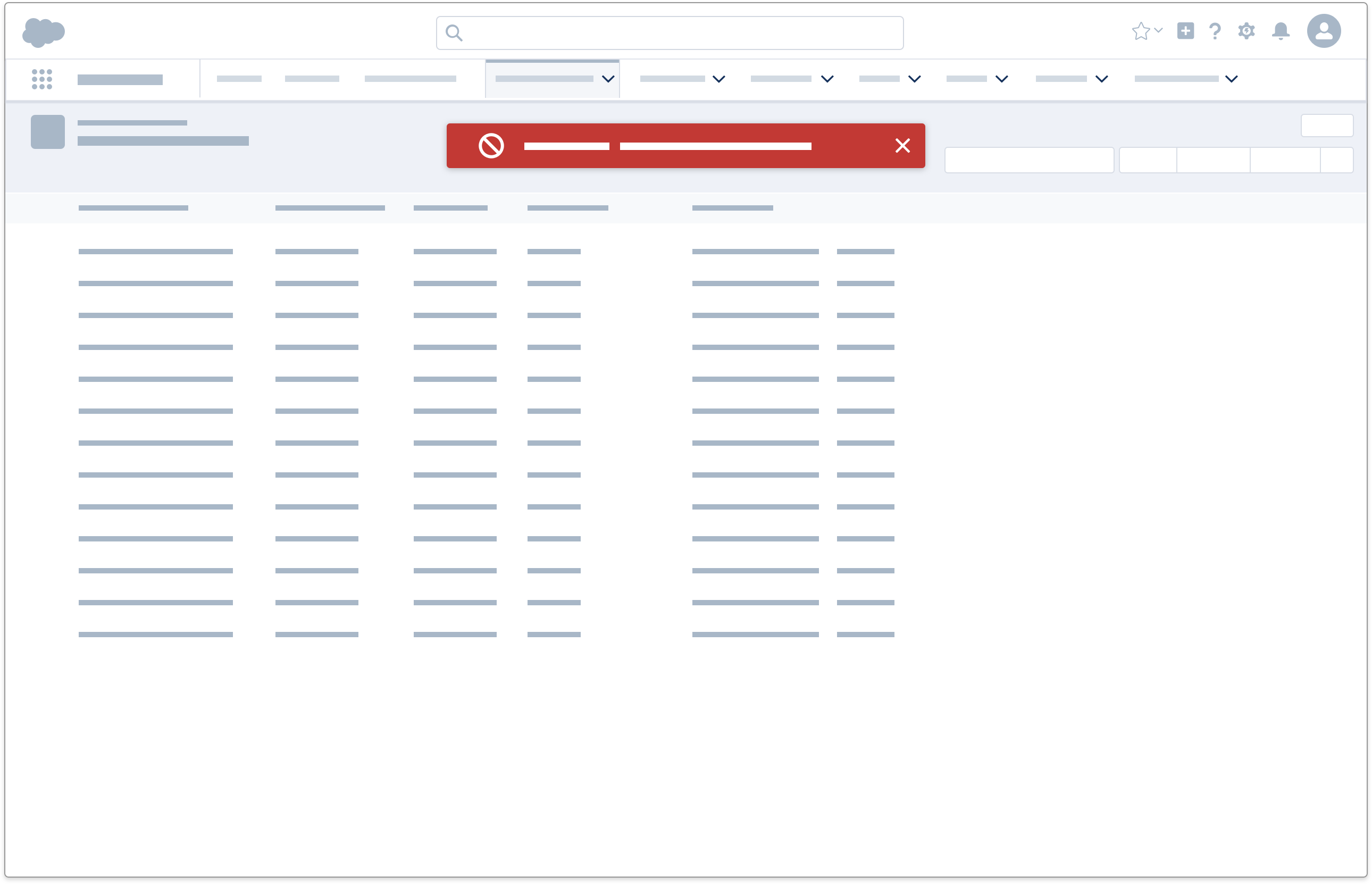
System Error (Current Session)
When a system related error occurs during an active session, display an alert.
System Error (Random)
In the rare instance a system related error occurs at random, display a prompt to notify the user.
Informational States
An informational state can appear in these scenarios:
- An item has an atypical status, e.g. duplicates
- A user completes an action, and there is additional info to be shown
- An admin-related status applies to user's active session
- The system becomes unavailable, e.g. under maintenance
- The system needs to communicate information that's important but not immediately disruptive to a user's workflow
Each scenario encompasses a slightly different informational state, as shown below.
Status Information
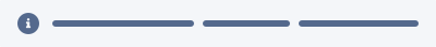
When there is a status change to content, display the icon variant of inline text icon variant of inline text.
Additional Information After A Successful Action
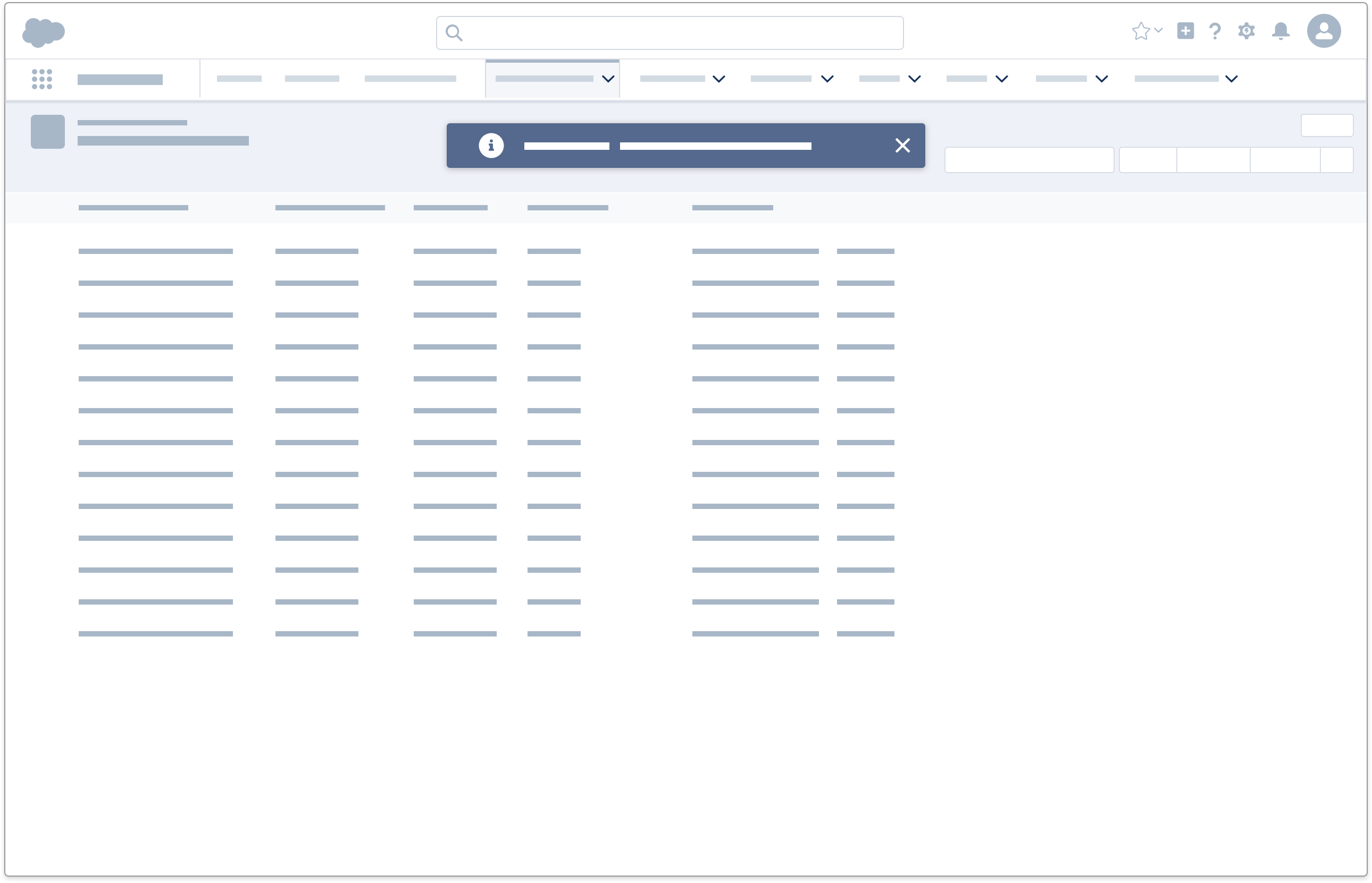
When a user completes an action, and there is additional info to be shown, display an informational toast.
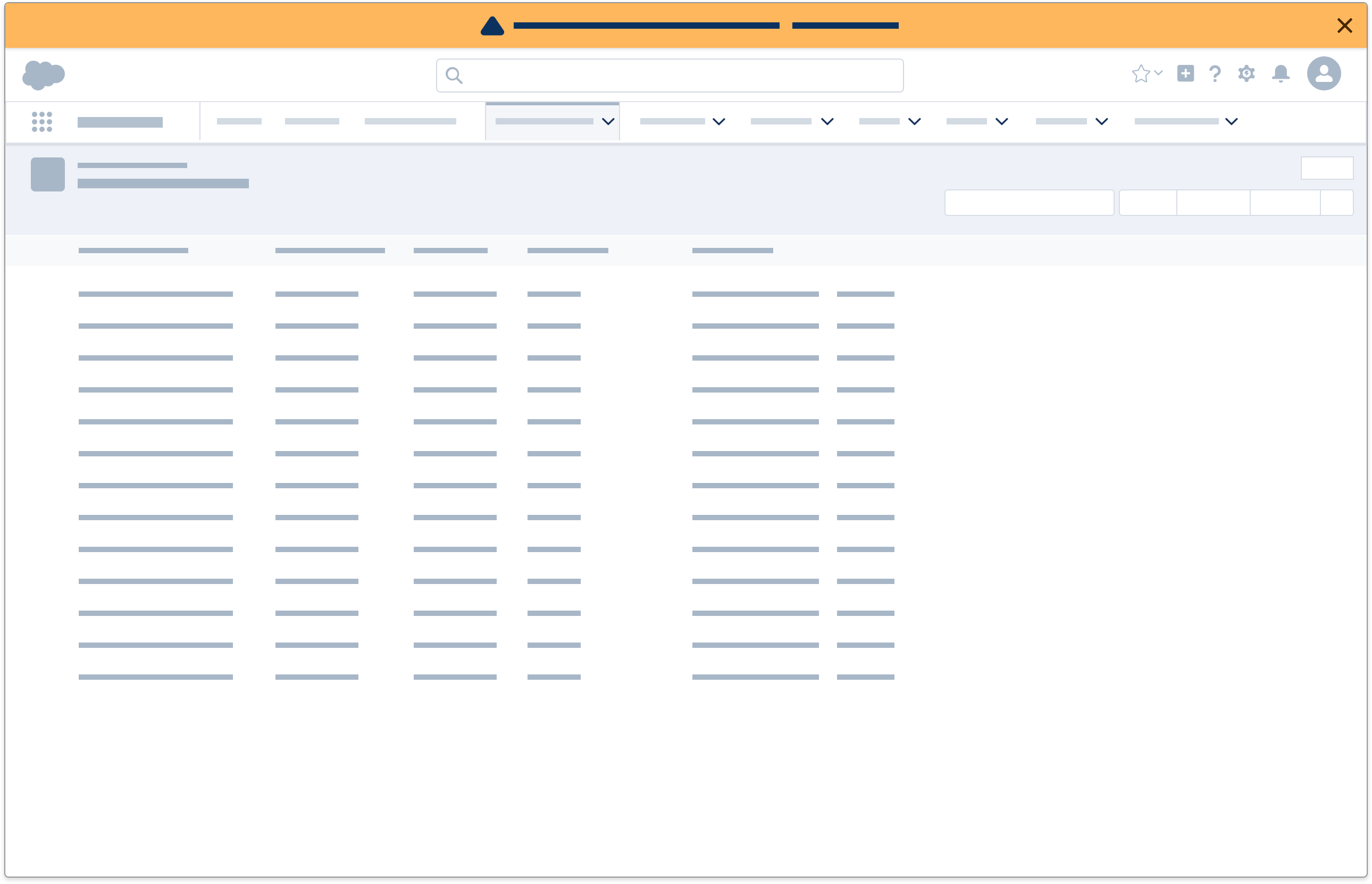
Admin-Related Information
When there is admin-related status change during an active session, display an alert.
System-Related Information
When the system needs to communicate information that's important but not immediately disruptive to a user's workflow, display a prompt.
Offline
An offline state appears when the system detects that there is a connectivity issue between user and system. This can be a result of a limited connection, for example patchiness or slow speeds, or a complete loss of connection.
When the system detects a connectivity issue, then display an offline alert until connection is re-established.
Success
A success state can appear in these scenarios:
- An action that requires user's manual input (e.g. submitting a form) is successfully completed
- An action that is triggered automatically (e.g. auto-saving a note) is successfully completed
Each scenario encompasses a slightly different success state, as shown below.
Manual Action
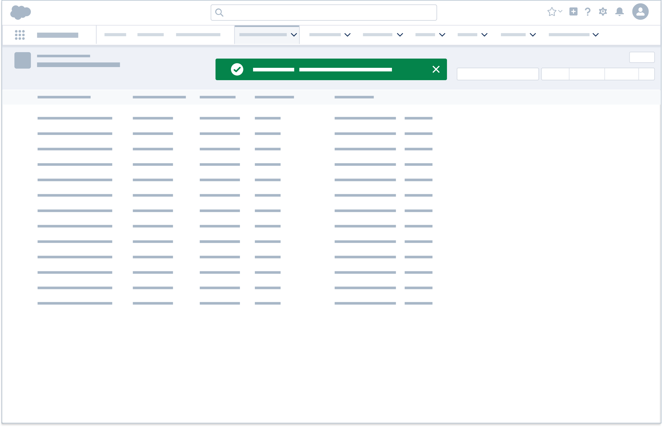
When an action is completed after user's manual input, display a success toast. Do not use toasts to confirm success when a create action brings the user to the newly created item. For example, creating a new record from a list view leads to the new record, so a success toast is unnecessary.
Automatic Action
When an action is completed automatically, display inline text. This is significantly less obtrusive and is ideal for high frequency success validation.
Transient
A transient state appears when the system is processing an action, e.g. saving, loading, sending email, etc.
When the system is processing an action, display inline text, which automatically disappears once processing is complete.
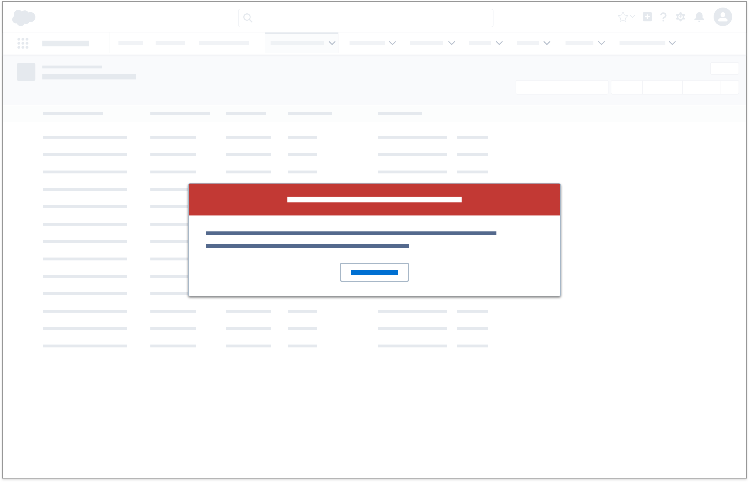
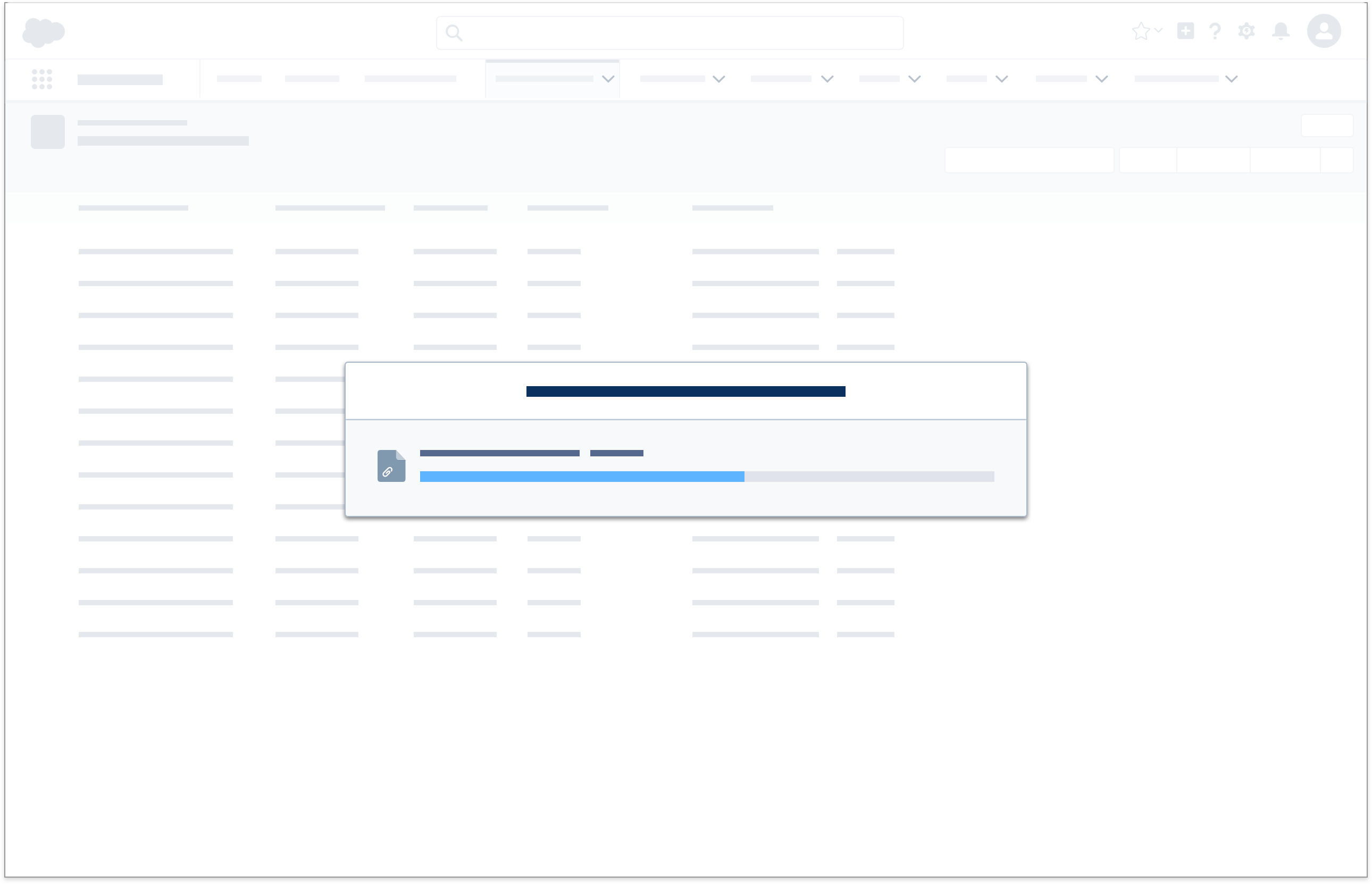
When the system is processing file upload(s), display a modal with progress bar that automatically disappears once processing is complete.
Warning States
A warning state can appear in these scenarios:
- The system detects potential issues with the form a user is working on (e.g. duplicates)
- The system nudges the user to engage with a record that hasn't had recent activities
- A user cannot complete an action due to external factors (e.g. permission) rather than something they can fix right away (e.g. form error)
- A system-related issue is affecting the user's current session
- A user is about to commit an action that is destructive, has major impacts, or abandons an incomplete action
Each scenario encompasses a slightly different warning state, as shown below.
Proactive Warning
Form
When the system detects potential issues with a form a user is loading, then display the icon variant of inline text as soon as it loads.
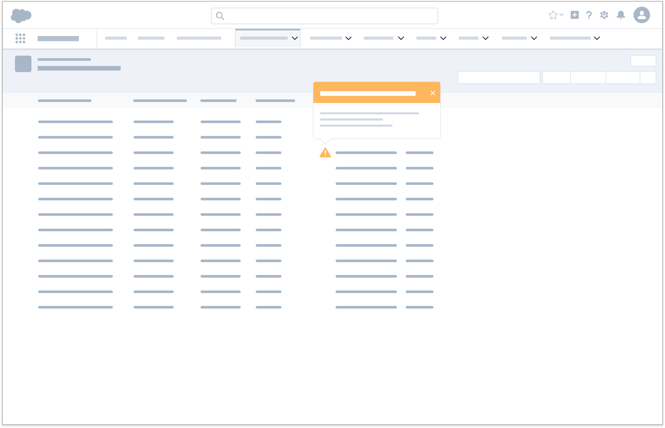
Outdated
When the system needs to nudge a user to reengage with an outdated item, then display a popover next to the item of concern. This typically appears in a list/card view, where many records are displayed on one page; the icon appears inside the affected card.
Incomplete Action
When a user cannot complete an action due to external factors, display a warning toast immediately after the action fails to execute.
System Related
When a system related issue is impacting an active session, display an alert.
User Confirmation
When a user attempts to commit an action that is destructive, that has broad implications or abandons an incomplete work flow, display a modal to confirm the action.
Accessibility Note: This confirmation modal ensures that the experience meets WCAG 2.0 accessibility requirements.